Services
Brand Identity
Styleguide
CLIENT
Beatsfest
(School Project)
The Context
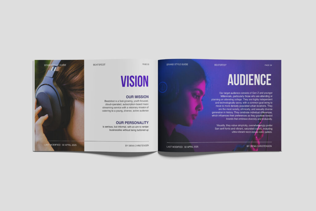
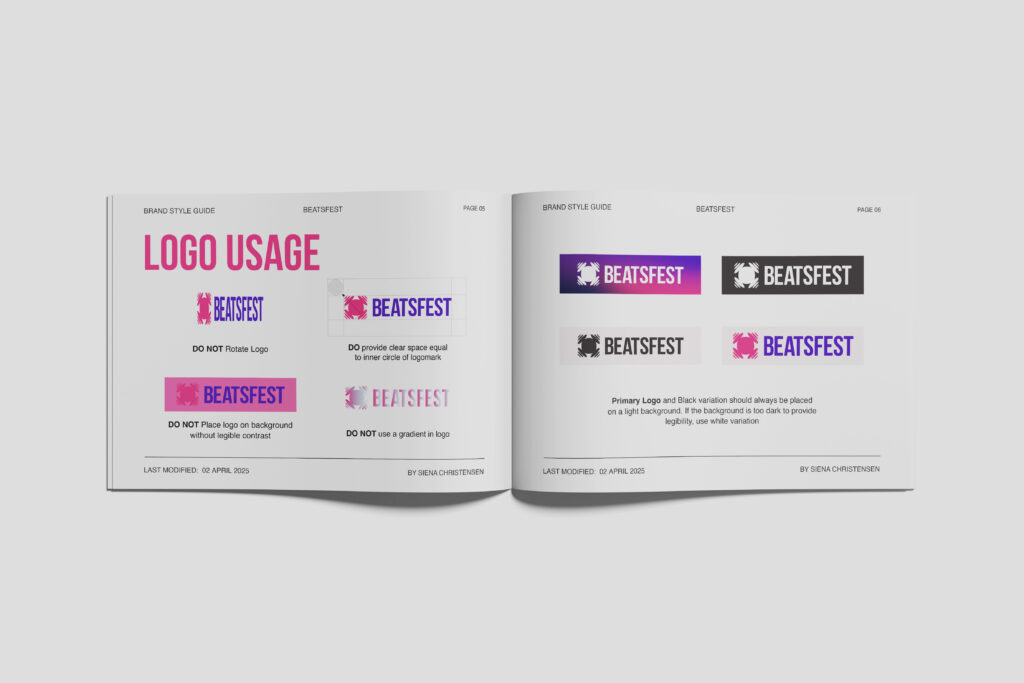
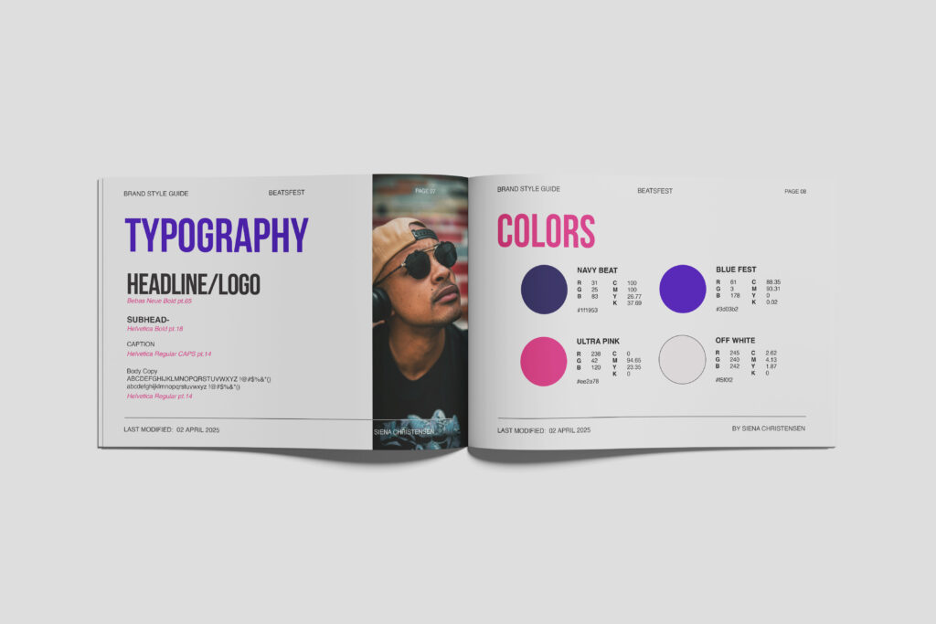
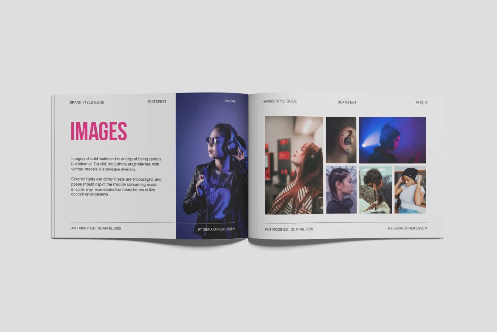
Beatsfest is a fast-growing, subscription-based music streaming service targeting Gen Z and Millennials. The bold and dynamic brand identity reflects its young, diverse, and tech-savvy audience.
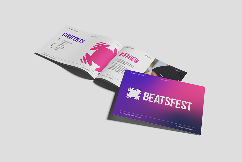
The design uses vibrant neon colors, clean typography, and a simple, scalable combination logo to balance high-energy visuals with a modern, user-friendly experience.
The Mood Board
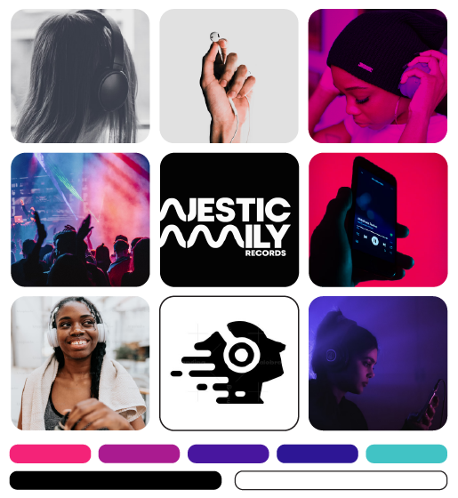
The mood board aimed to convey authenticity, boldness, and simplicity, strongly focusing on color usage to enhance visual interest.
The Process
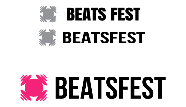
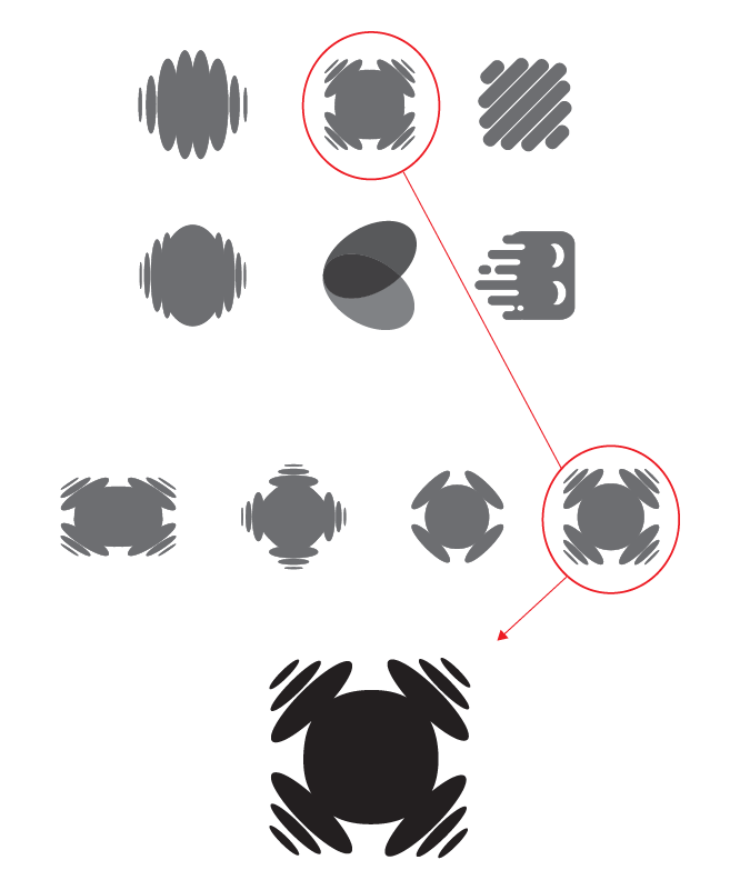
Competitor analysis led to the use of a soundwave-inspired logomark. After client feedback, the logo was refined and finalized.
A clean, bold sans serif was chosen for its simplicity and refined to create the logotype and final logo.
